Monday, 18 May 2015

Denim+


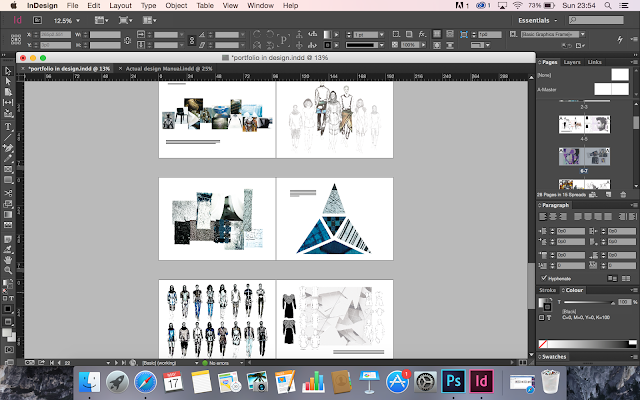
I have finished my final pages for my denim+ project, I have tried to incorporate my best mood board pages, sample pages, a few of my fifty designs, technical drawings my final line up and images of my final garment. I think theses are the best pages as they flow really well and they all show some of the different strengths I have and they also show my ability to do a variety of different things. 

I have tried to keep this project looking quite minimal and modern as the project was about armour and futurism so I thought this would be very in keeping with the futuristic aspect of the project. Each of the double page spreads incorporate similar colours from the previous page to give the feel that the project really links together well and this also helps the pages to flow nicely. I've added small paragraphs to explain what i have done on each page and how it links to the project as a whole. 

Monday, 11 May 2015

Laying Out My Pages


My digital application unit and my white shirt unit were much simpler to put into my portfolio as they didn't need alot of editing or rearranging. I've tried to keep the pages as simple as possible leaving alot of white spaces, I also tried to make the pages flow by incorporating little splashes of colour on each page so that the following page would link with the previous page.


I have incorporated images of my final white shirt in particular the collar and the cuff and have written a little paragraph of where my inspiration came from and how it links in with my research. 


I have also started arranging the first two pages of my denim unit, the work in this unit is my strongest, because of this it will be the biggest project in my portfolio page and it will be minimum of 8 pages long. 


Monday, 4 May 2015

Creative Realisation


I have continued to put my portfolio together,  I've been editing and arranging some of my work from my creative realisation unit. The work from this unit has been difficult to arrange and put into a portfolio as alot of it was quite faint and difficult to see, because of this I only used four pages of work as I feel it isn't my best work. 

I have tried to make all my pages flow by using the tear drop tool in Photoshop to pick up some of the grey tones from the mood board and incorporate them into the other pages using a simple decretive strip.